Perceptually uniform colors using HSL
Overview
During the discovery phase of the Amobee design system, it became clear that the de facto color palette of primary, secondary, and neutral tints and shades was not going to suit our needs. The color needs were complex and beyond branding and button states. We needed smooth color scales and accessible hues for data visualizations... and saturated and desaturated variants to equalize color emphasis on backgrounds in light and dark modes.... and we needed a process to add or swap hues with a partner's brand colors when creating a custom-themed UI.
We needed a system.
Solution
After spending extensive time researching other designers’ solutions, exploring programmatic methods to generate color variants, and considering the use of newer color spaces, I wasn’t able to find a solution that addressed all the parameters of color I wanted to control. Determined not to settle, I set out to develop my own system for correcting the deficiencies of the HSL color space. The final deliverable was a set of color indexes that served the different roles that color played within our platform. Each index was comprised of the same hues, so they were easy to reference and worked harmoniously with each other across the other indexes. The process I used to create these indexes is described below, from start to finish.
Base Hues
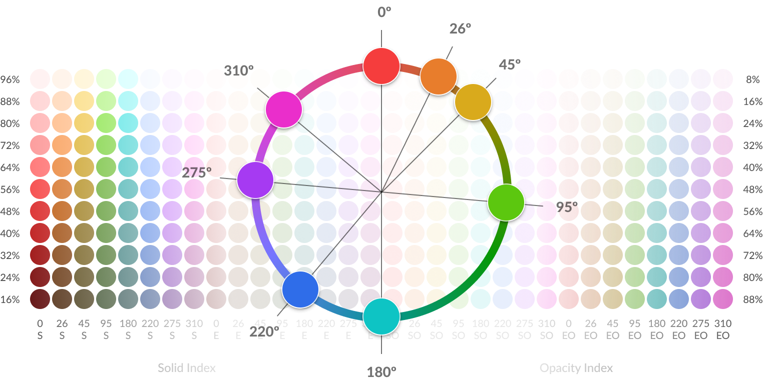
The first step for creating the color palette was selecting the hues. The objective was to select hues that were as disparate as possible. Logically, one would assume that the best way to achieve this contrast would be to select hues that are equidistant from each other along the spectrum. Unfortunately, perceptual differences between hues are not equidistant and are less differentiated around the red. blue, and green primaries.
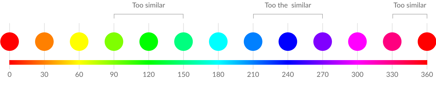
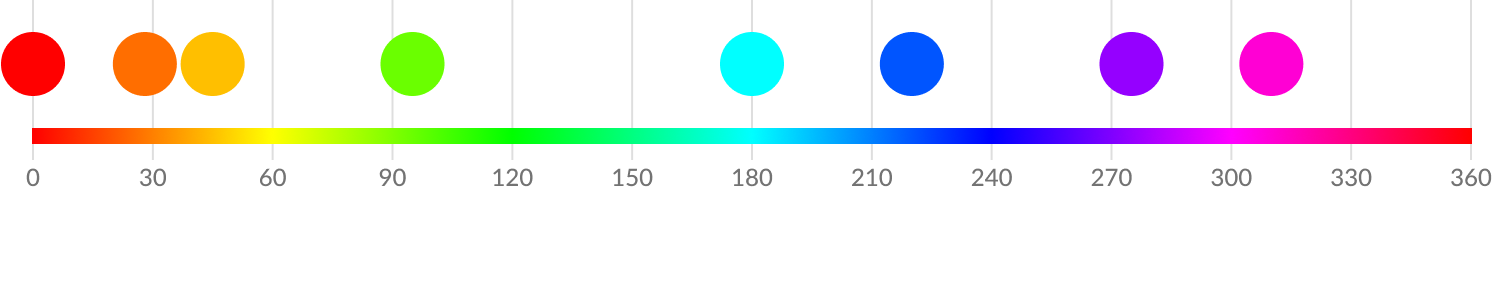
Therefore, the base hues for the palette had to be selected manually. Outside of having to include the semantic hues (green, red, yellow), and Amobee’s brand hue (called “primary”), I was able to cull together four more distinct hues for a total of eight hues. These eight hues became the base hues that defined all the colors in the indexes.
Refined Set of Disparate Hues
Color Scales
A color scale is a set of colors that share the same hue but range in their luminosity from dark to light.
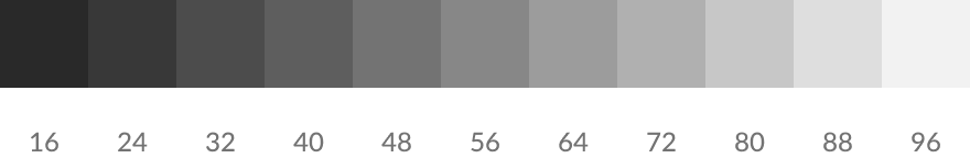
Grayscale
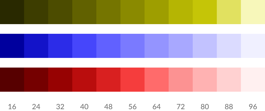
The first scale I needed to create was an 11-step grayscale that ranged in luminosities from 16-96. This scale had dual purposes — it was the color values for the gray colors in the index, and (more importantly) it defined the luminosity values for every step for all the other hues.
Grayscale = Luminosity Scale
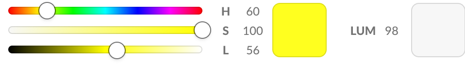
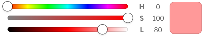
Luminosity NOT Lightness
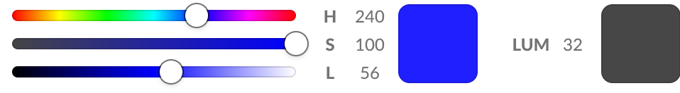
Luminosity and lightness are sometimes used interchangeably, and the difference needs to be distinguished. In the context of the HSL color space, “lightness” is a measurement of lightness relative to a color’s hue. Luminosity is a fixed measurement of lightness that applies equally to all hues in the spectrum. Luminosity can also be thought of as an equivalent grayscale value – meaning how the color appears as if it was converted to a grayscale image. As demonstrated in the image below, the blue and yellow colors have the same saturation and lightness values, yet they do not appear as the same lightness when their hue is removed. The yellow color has a luminosity of 98, while the blue color has a luminosity of 32.
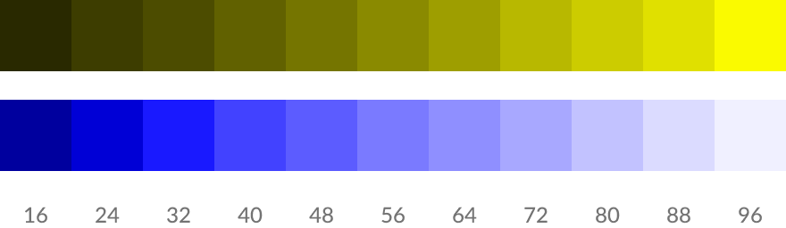
If we then proceed to create scales by changing lightness at 8% intervals, the problem becomes visible. Hues with high luminosity (like yellow) have indistinguishable steps on the light end of the scale, and lower luminosity colors (like blue) have indistinguishable steps on the dark end of the scale.
Lightness Scales
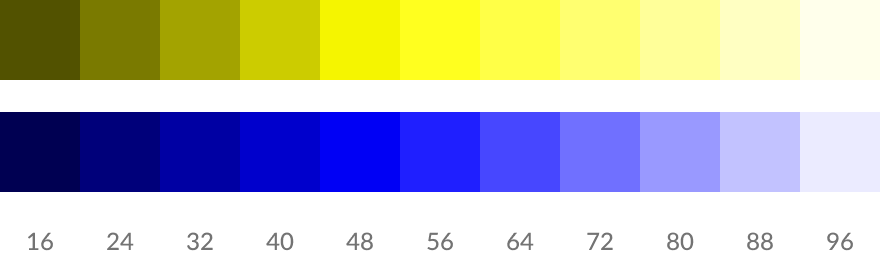
In comparison, scales created by changing luminosity at 8% intervals produce smooth and equal steps and are far more usable for a variety of color applications.
Luminosity Scales

Final Base Color Adjustments
Before I began scaling out all the luminosity variants, I needed to make some final adjustments to the base hues. I wanted to future-proof my method for creating color scales so it would be able to generate useful and even-looking scales from any selected hue. Through experimentation I discovered that the most difficult hues to create scales from were the lightest and darkest hues, so I again used yellow (60) and blue (240) as my extreme hues to balance. As you can see below, without changing where their most colorful state is placed on the luminosity scale, there’s no room left for lightening yellow and very little room for darkening blue.
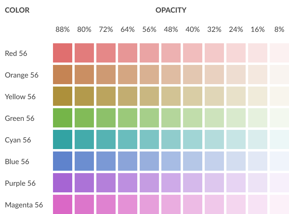
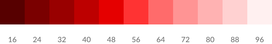
The only option to create lighter steps of yellow and darker steps of blue was adjusting the lightness of yellow to be darker and the lightness of blue to be lighter. However, making lightness adjustments would also affect the saturation of these colors, and therefore all of the base colors would need saturation adjustments in order to be balanced. The further adjustments didn’t bother me though, and I had already been thinking that the base hues needed their saturations adjusted due to their appearance in the color scales they created. Their luminosity steps appeared even, but the base colors themselves appeared a bit too saturated in relation to the other colors in the scale. An example of this can be seen in red 56 below.
So I needed to find a solution that would lower or raise luminosity, but also inform me of how much saturation was lost in the adjustment. To do this I came up with my own formula that provided me with a metric I called “colorfulness”. The colorfulness metric was calculated from the saturation and lightness values and it measured the true amount of hue being displayed. This can be shown by simply changing the lightness of a color and leaving saturation at 100%
After experimenting with different levels of luminosity and colorfulness, I found the sweet spot between preserving colorfulness, and the ability to move the yellow and blue base colors towards the middle luminosities, to be a colorfulness of 74%. This is the setting that was used to define the base colors for the Saturated color index.
Scales at 74% Colorfulness
Color Indexes
A color index is a matrix of colors that are arranged by color name along the y-axis and luminosity (or opacity) along the x-axis. Since many of the color names and luminosity values were the same between the indexes, the indexes were named after a property of color that made them unique to colors of the same name in other indexes. For example, an index might have a name such as saturated, solid, opacity, etc.
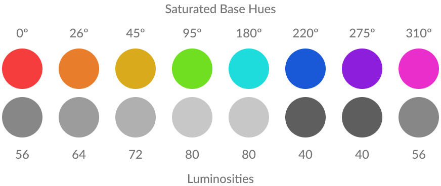
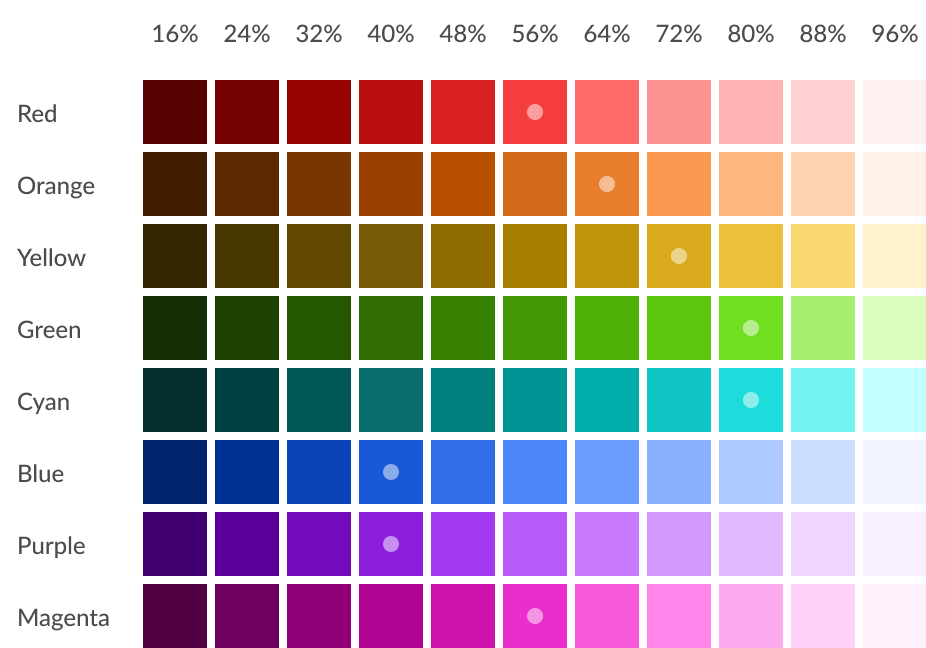
Saturated Index
The saturated index contained the most saturated hues, tints, and shades of the color system. The base colors of this index were defined by adjusting their saturation and lightness to a colorfulness setting of 74% while also matching the closest grayscale luminosity level between 40 and 80.
Saturated Base Hue & Luminosities
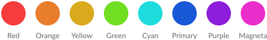
Hues were renamed to their elementary color wheel names to make them easy to locate and reference.
Then the scales were created with the colorfulness formula luminosity levels applied. The white dots in the image below indicate the base hue color in the scale of the index.
Saturated Solid Index
Equalized Index
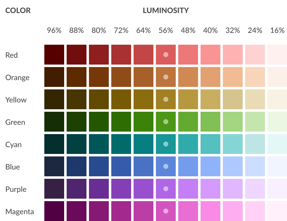
The equalized index is a set of more muted hues, tints, and shades of the color system. The base colors of this index were defined in the same manner as the saturated index but specified with a colorfulness of 50% rather than 74%.
Equalized Base Hues & Luminosities
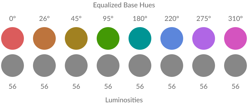
The unique and useful characteristic of this color index is that all the color properties between the colors in the index and equal (therefore the name of the index). This means that the corresponding luminosity level from every hue also has the same level of saturation – the most saturated luminosity level being at 56% and then the saturation levels evenly tapering to the lighter and darker ends of the luminosity scale. Again, the white dots in the image below indicate the base hue color in the scale of the index.
Equalized Solid Index
Opacity Indexes
The opacity indexes had a slightly different structure to their matrices. The color name remained the dimension of color that described the y-axis, but opacity replaced luminosity as the dimension of the x-axis.
Saturated Opacity Index
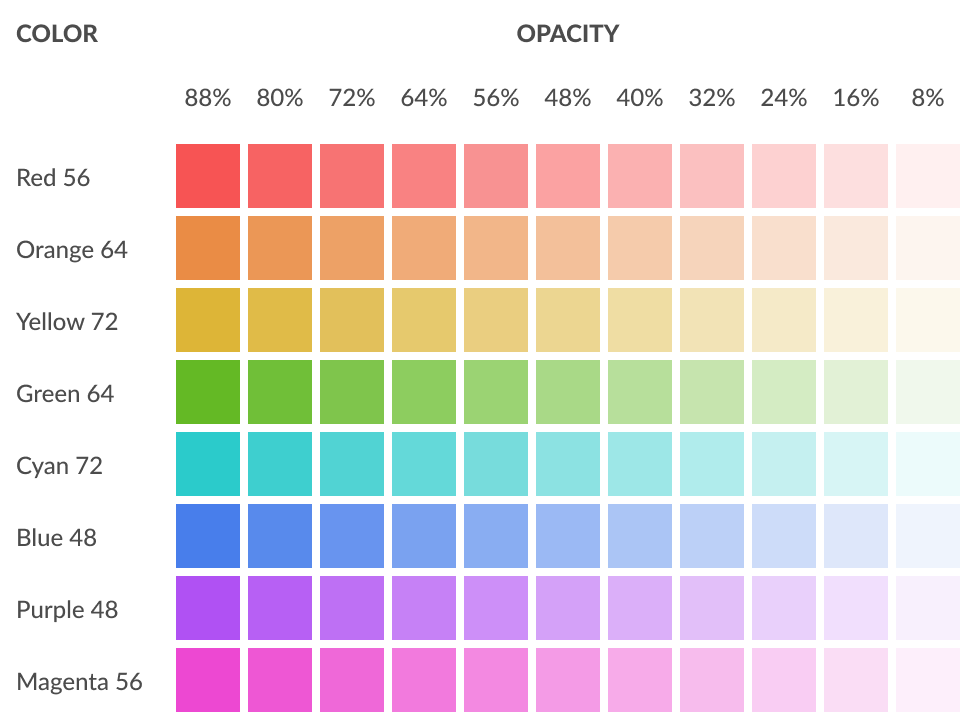
Equalized Opacity Index