Bringing order, efficiency, and beauty to an enterprise platform.

Foundations
Foundations are the visual design ingredients and guidelines for creating harmonious, and coherent user experiences. (typography, color, iconography, and layout)
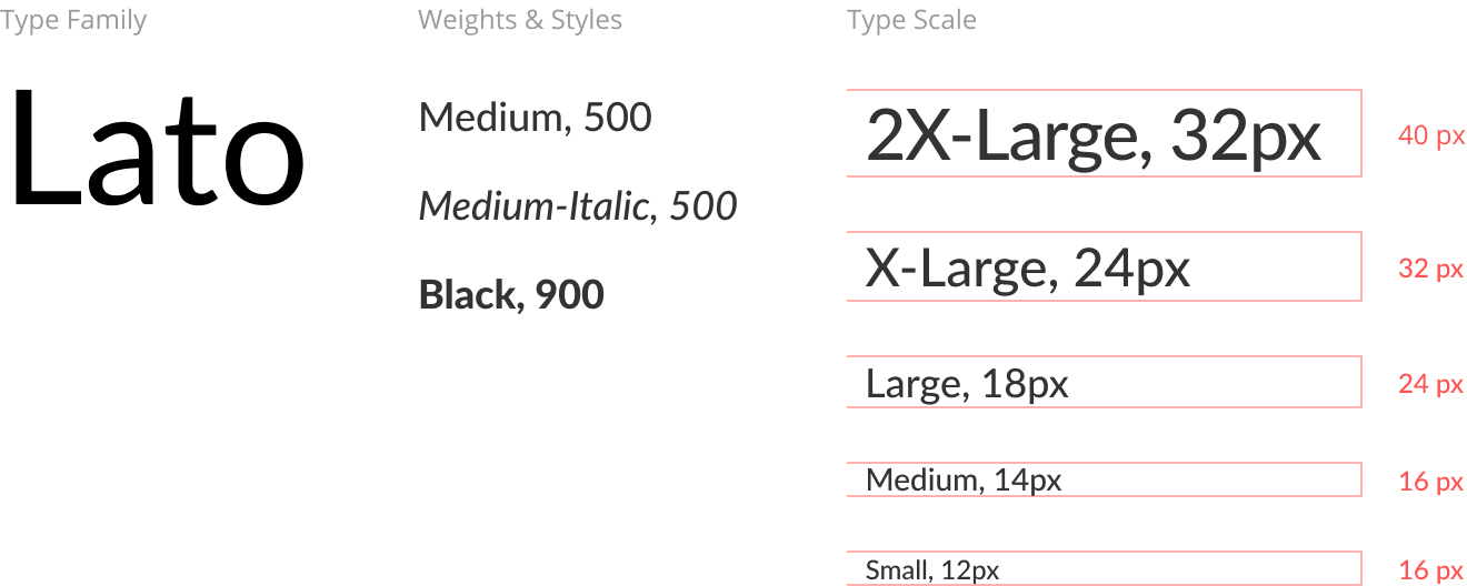
Typography
Lato was the typeface selected for its balance of form and function. Its large x-height and contrast of weights optimized readability, and its humanistic letterforms communicated a modern but approachable look. Font weight and style options were refined to just the essentials, and then a type scale was developed as one of the atomic elements to define the rhythmic relationship between content and space.
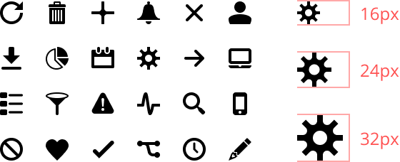
Iconography
As with typography, iconography is another atomic element of the design system and was developed to follow the same sizing rules. Icons were designed at their smallest size of 16x16 pixels and scaled up in increments of 8px.
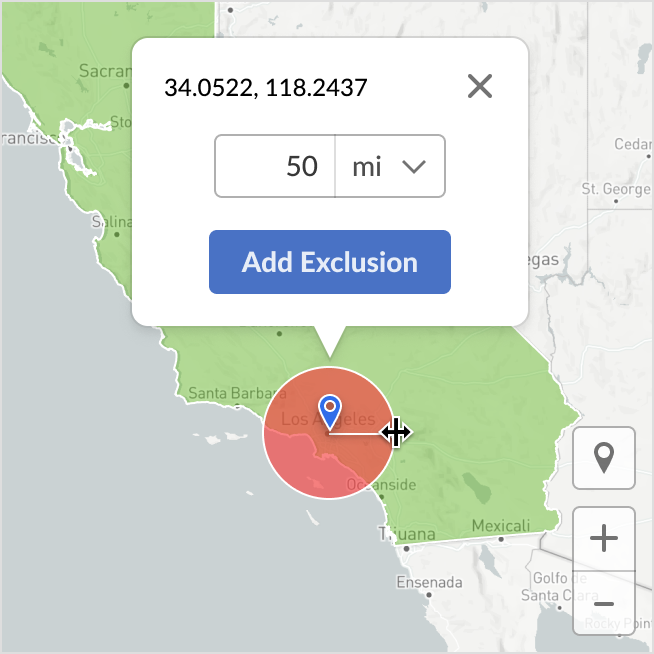
Layout
A base spacing unit of 8px was used to define both the size of elements and the space between them. Limiting the increments of size and space created order and rhythm to the overall gestalt of the UI.
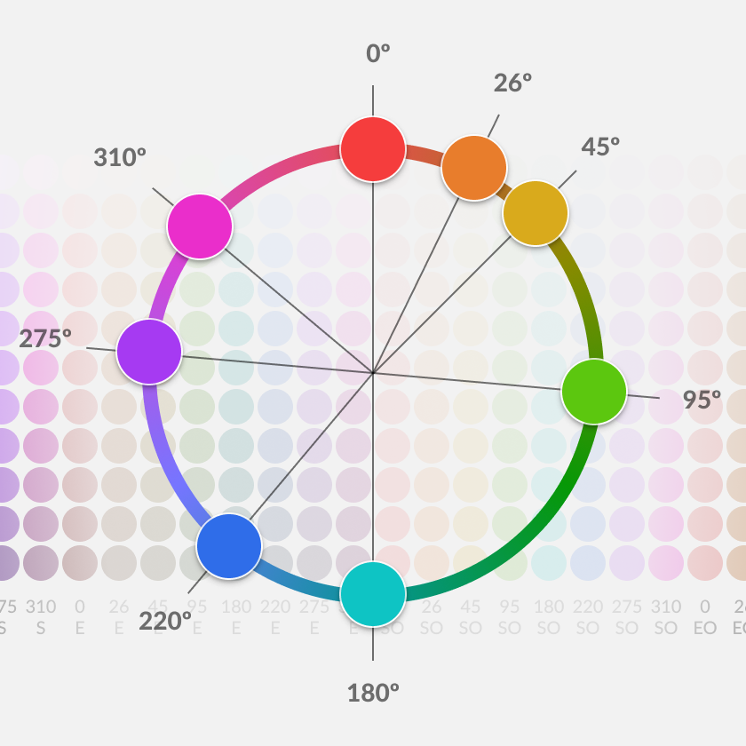
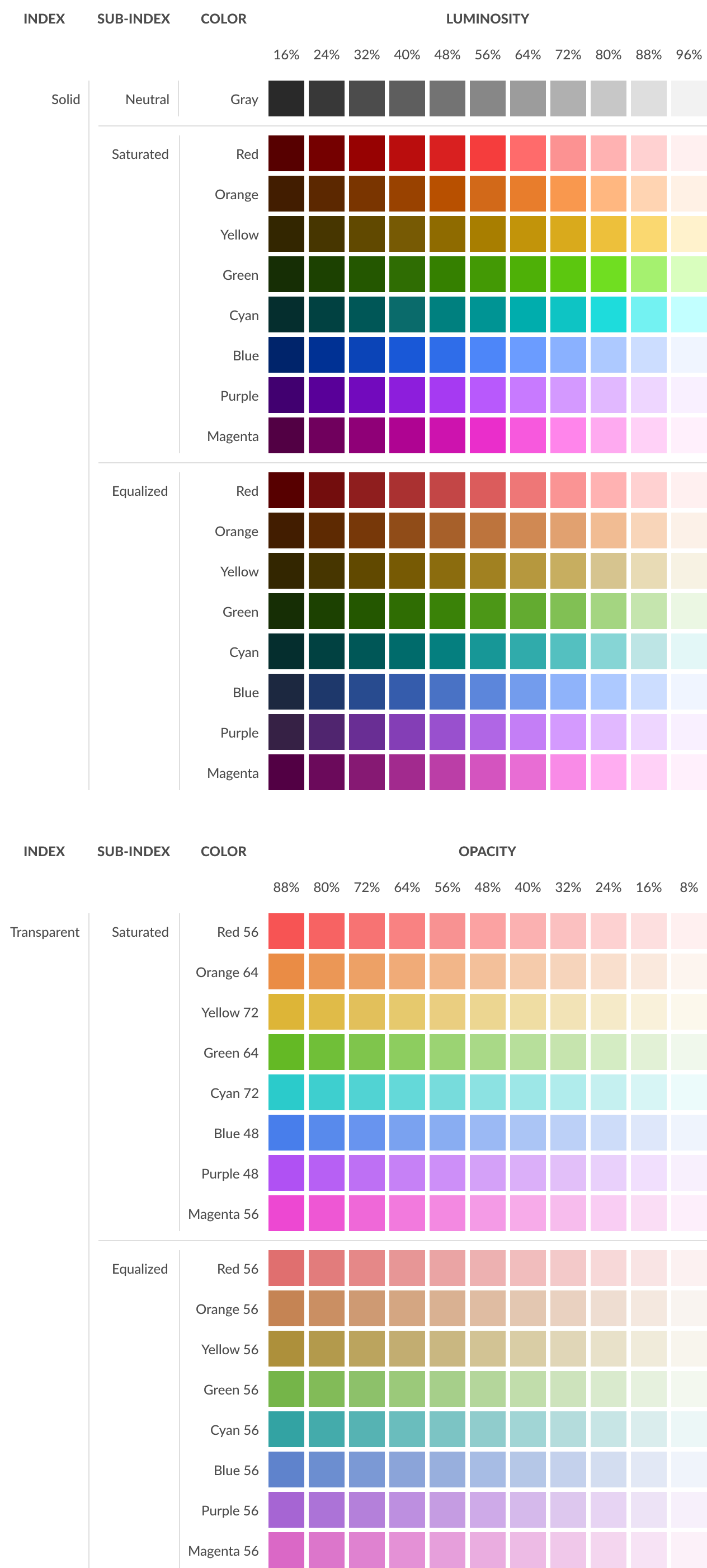
Color
The color solution for the design system was so challenging and complicated that it became its own project, and can be reviewed here.
The final form was a collection of color indexes where the user could intuitively access colors first on a level of colorfulness and then second on a level of luminosity.

Components
Components are the smallest building blocks for developing a user interface. They are used for communication, interaction, and organizing content.
Accordions
Accordions toggle the display of content.

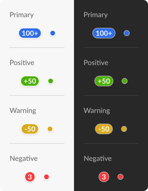
Badges
Badges contain text and background color and are placed above objects to provide brief contextual information.
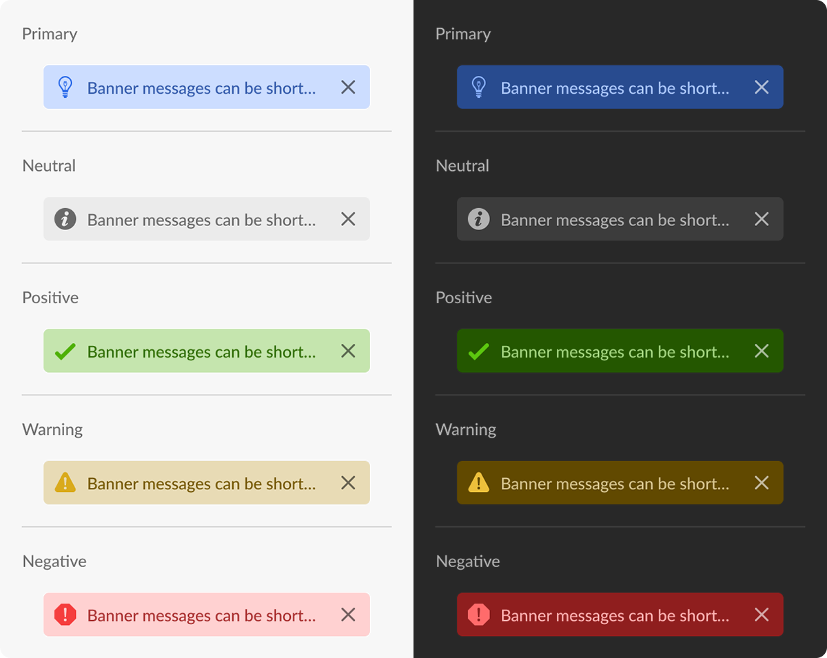
Banners
Banners display important information about the content that resides adjacent to its location on the screen.
Breadcrumbs
Breadcrumbs displays a hierarchical path view of the location of the current view.
Basic Breadcrumb

Select Breadcrumb

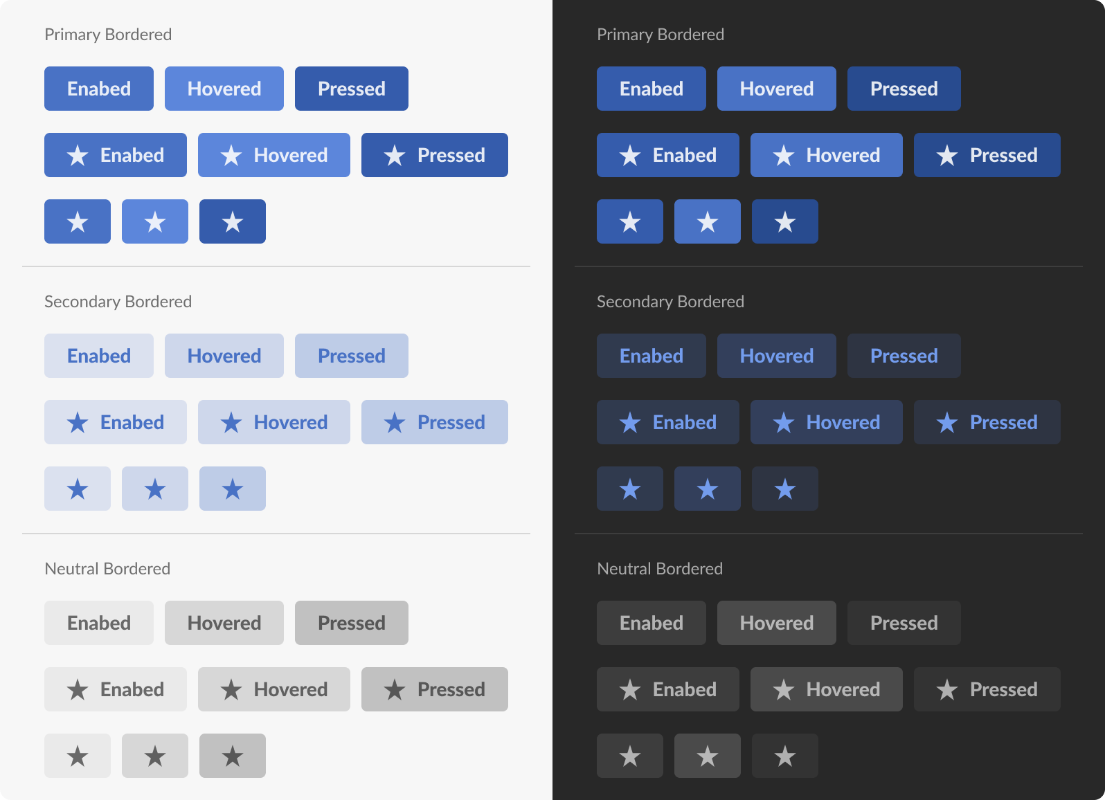
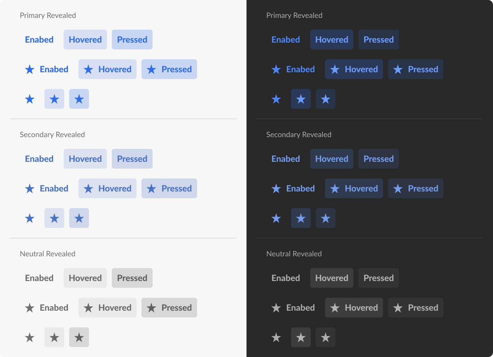
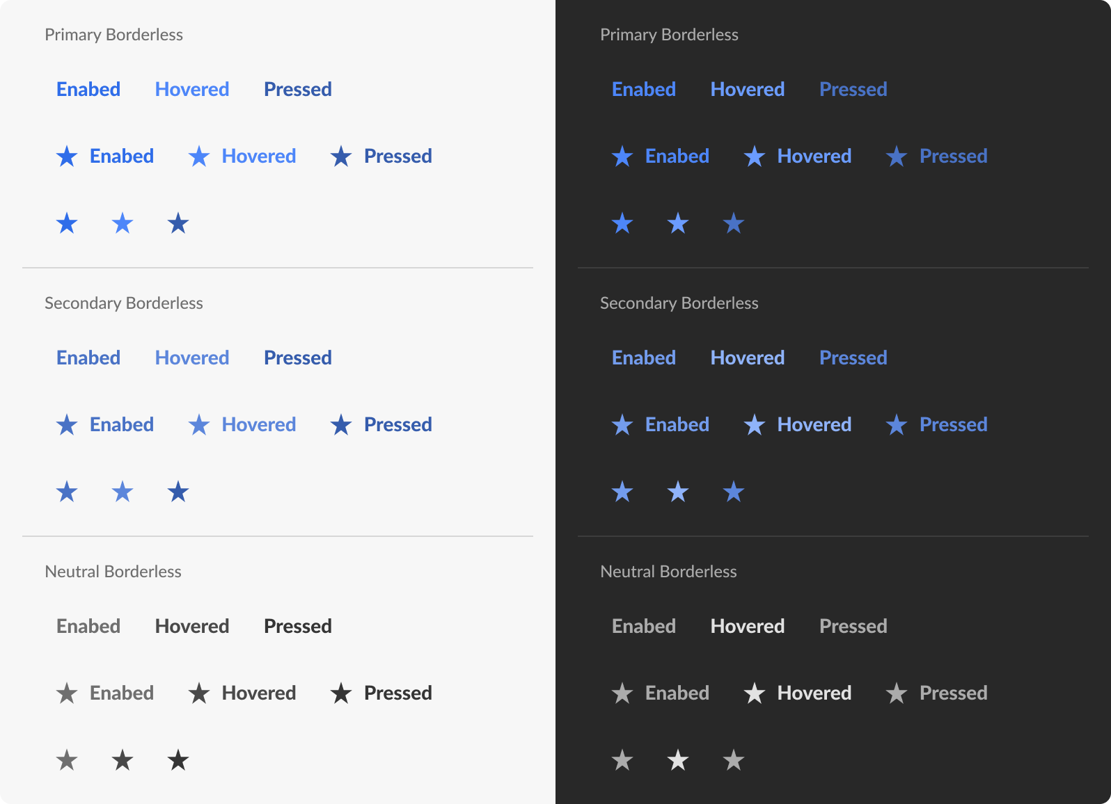
Buttons
Buttons are used for initiating actions. They appear in a variety of forms and colors depending on the context in which they are placed and the emphasis needed to lead the user to complete a task.
Border Buttons
Revealed Buttons
Borderless Buttons
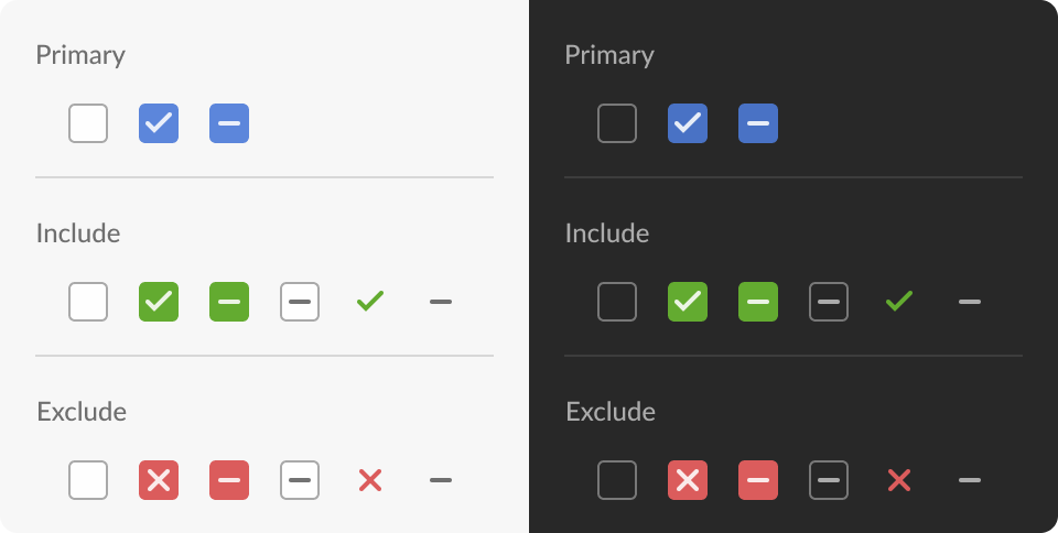
Checkboxes
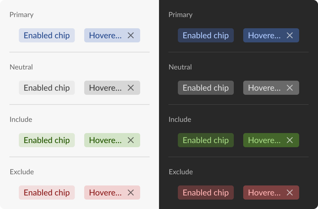
Chips
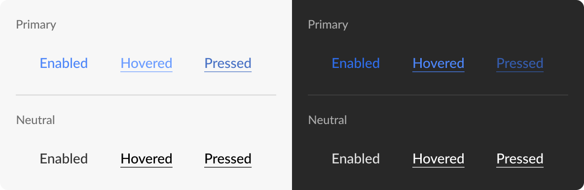
Links
List Items


Menu Options


Progress Indicators


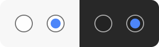
Radio Buttons
Selects


Sidebar Navigation


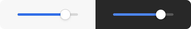
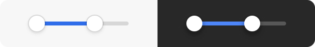
Sliders
Switches

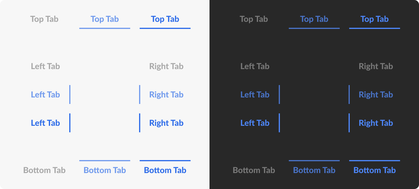
Tabs
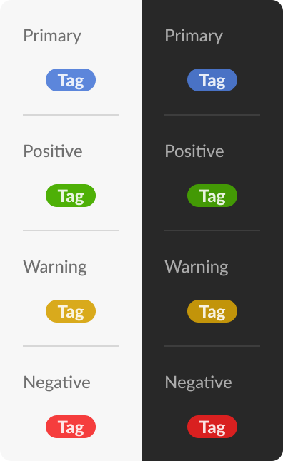
Tags
Text Fields


Toggles